Grid2 (curse link) is NOT a grid sequel. It’s a completely different set of frames. It can look a lot like the boxes of Grid (original, or “Grid-Prime”) or Vuhdo. Most things you can do in Grid-Prime (with a plugin) or Vuhdo can be done in Grid2. There are additional features as well that I really like.
Grid2 compared to Grid-Prime
The effect of Grid2, is very similar to using Grid-prime with a whole shitton of plugins to add icons, extra text, and extra indicators. Except that:
- you don’t have to worry about all of the plugins separately updating
- free-form indicator placement and sizing (serious customization)
- the priority system is easier
- easier to add custom buff statuses (again, without a plugin)
- rectangular “boxes” are possible. I like these a lot
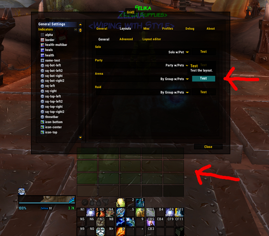
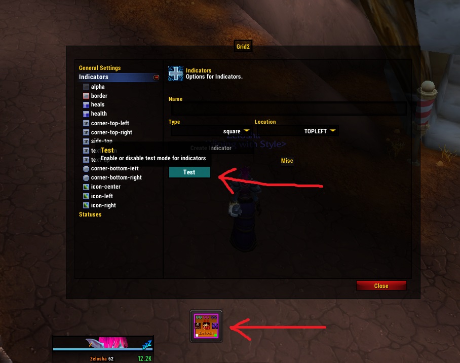
- Test mode! As you well know, it’s difficult to set up your frames and see how everything will look without a live group getting their asses handed to them.
Grid2 compared to Vuhdo
Yep, you can get basically the same effects, but:
- easier to mix and match using icons for some things, text for other things, and boxes for still other things.
- more free-form placement of indicators
- I find the setup generally easier (what’s a bouquet?)
- no private tanks (if you like that sort of thing, bummer)
Grid2 has a lot of bells and whistles to give you all the information you could ever want, and it is easy to get caught up in show all the things. But do not lose sight of the fact that your raid frames are at the most basic level intended to show you what you need to know to make decisions about healing. At the same time, the frames need to filter out useless crap that you don’t need to know about, even if it would be nice to know. The more extraneous shit you have, the less likely you are to quickly notice and react to the important things.
So pick out what is important to you, and let’s get started.
Basics
In order to get into boxes and pretty colors, you first need to know the basics of status and indicator.
Status means the thing that you want to show, including buffs and debuffs and aggro.
Indicator means how you intend to show the thing. This includes the border of the frame, text, boxes, and icons.
Then you add the status to the indicator. That’s it. Figure out what you want to track and where you will track it. There are a few more bells and whistles, but that’s the basic idea.
Group Settings
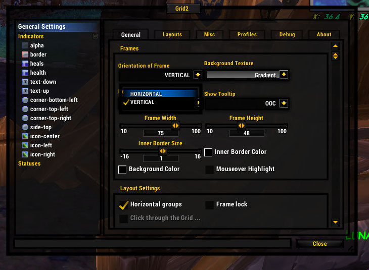
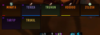
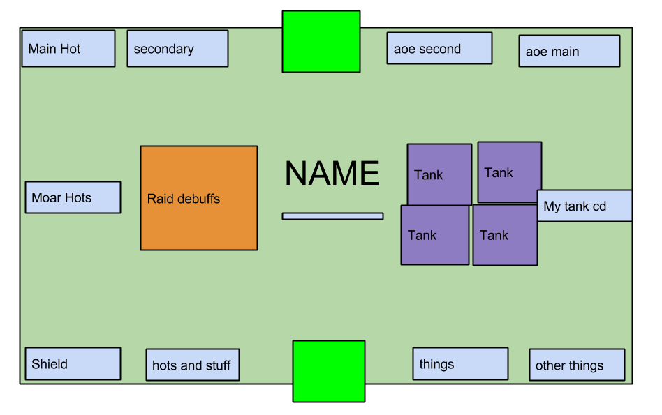
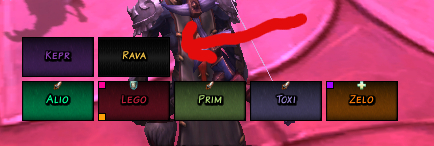
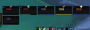
Horizontal or vertical groups. Vertical groups make sense visually and cut down on mouse movement if you’re using rectangular boxes (no difference for the completely square boxes). That said, I now use horizontal groups because it works better with my UI. You can use test mode to set up your groups the way you want them.
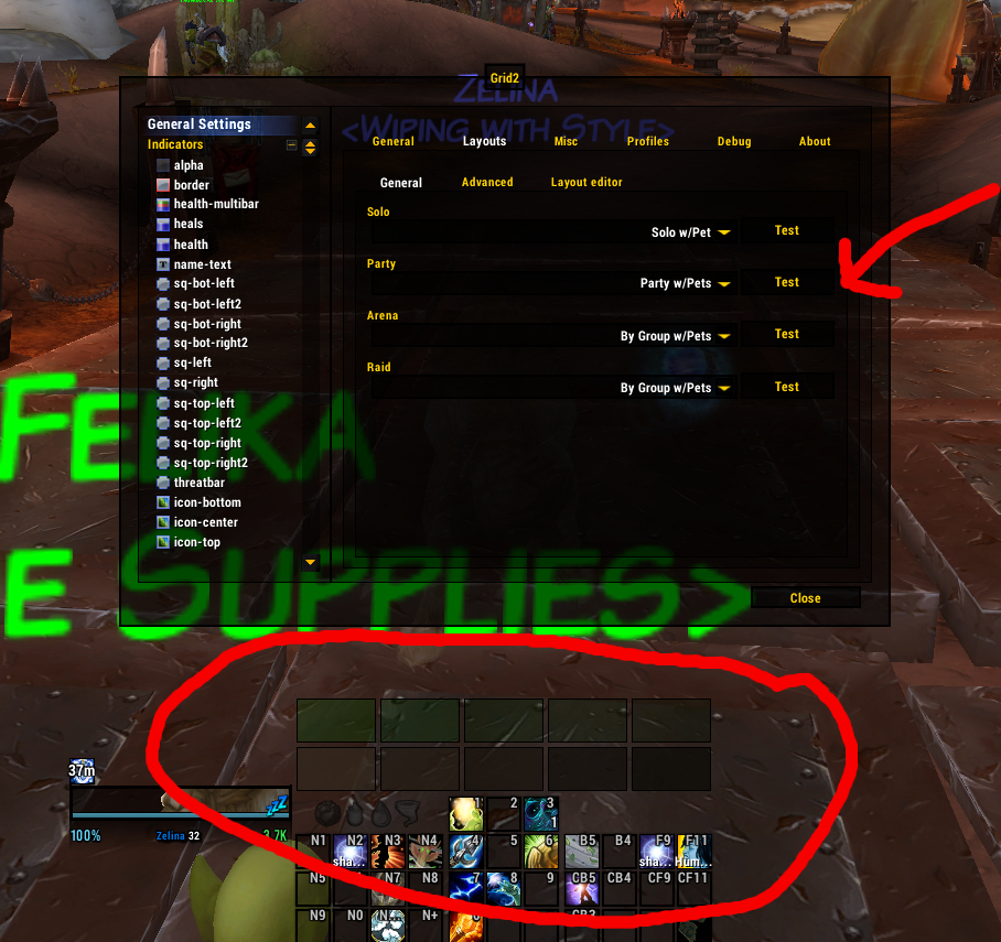
My horizontal groups.
Group Anchors and Sizes. Personal preference again. Anchor is where your first group member goes, and then the growth direction from there is which way it will expand as you get more group members. Check test mode to make sure the directions are right.
Group Setup. Do you want to show a raid frame when you’re soloing? Do you want pets to show (pft pets suck)?
Frame Display
Orientation of the bars. Vertical bars are the default and seem so cool and like a space-saver, but I just cannot make my brain register health in that manner. It’s easy to change it to horizontal bars and more rectangular frames.
Background Texture can also be set. This allows you to set the background so that missing health is easier to see. If you are using invert colors, your background becomes your foreground and that will be the texture of your main bar.
Profiles
Profiles work about the same as any other addon. You can have your toons use the same profile, save different profiles for different specs, or copy from one profile to another.
If you want to be like me, you can name your profile Being Awesome. I’m currently on version Being Awesome 3.
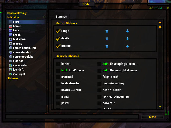
Statuses
Most statuses already exist. You may want to fiddle with some stuff, like changing a color, but most statuses are preprogrammed for your convenience, including the class buffs of the character you’re logged in with.
Default Statuses
There are plenty of statuses preprogrammed that are definitely not buffs, debuffs, or heals, but are still important.
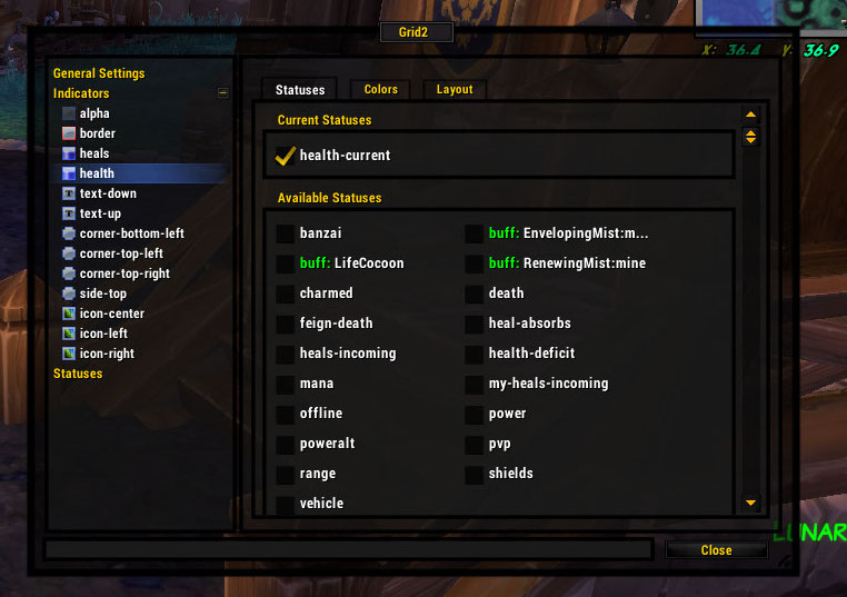
Health
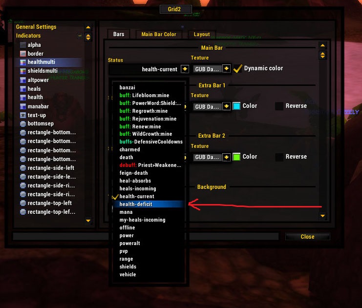
- Health-current is the amount you have.
- Health-deficit is the amount you are missing
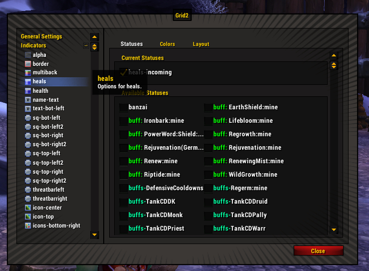
- Incoming Heals come in two varieties: heals-incoming or my-heals-incoming. If you want to squish them into the same status, that is handled by a check-box in heals-incoming.
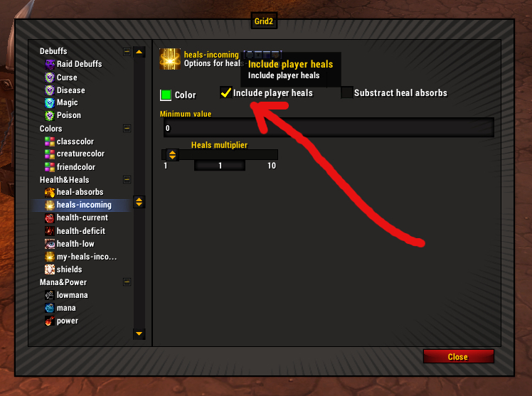
The check box to include your own heals in “incoming heals” so they all show together.
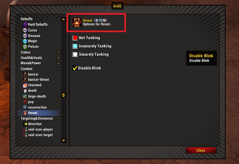
Threat. You can customize the color and whether it blinks.
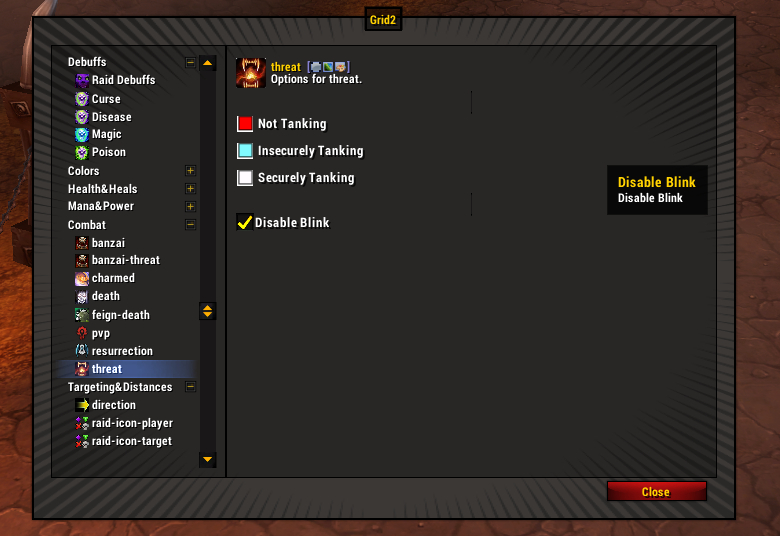
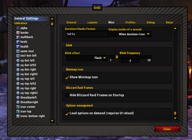
To adjust blink frequency, you head to the General Settings options, Misc tab.
Banzai and Banzai-Threat
The grid2 author kindly explained it to me, and I’ll try to recount it in a way that makes sense.
Banzai and Banzai-Threat track the target of the boss. When used with a text indicator, they will show which mob is the culprit.
Banzai-threat tracks the current target of the boss. It will move every time the boss changes targets (so this is for tanks and tank swapping).
Banzai highlights the target of the boss if the boss changes targets, but ONLY IF the boss starts casting some nasty spell against the person. This is useful in the case of a boss that randomly shoots a very bad spell at a poor sissy dps.
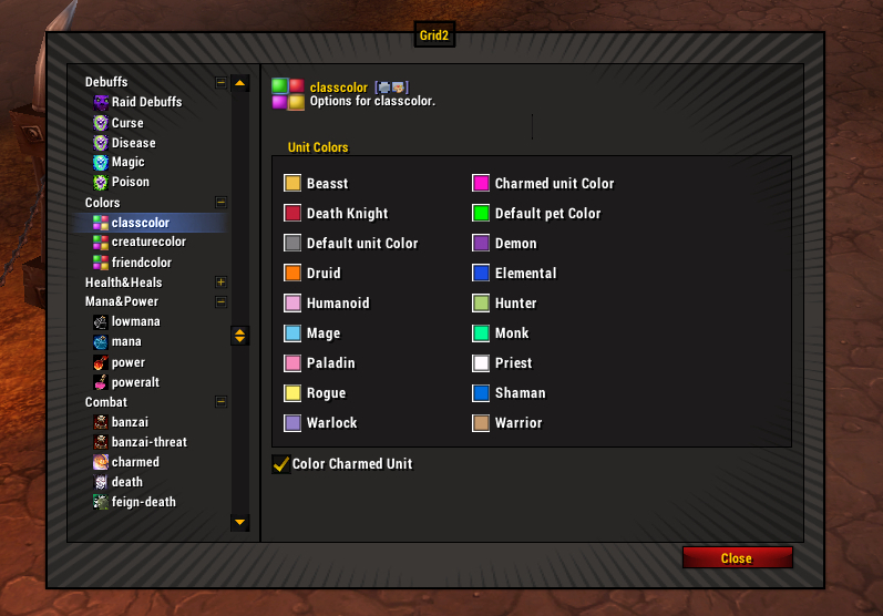
Colors. You can adjust the class colors if you want, or the colors for friendly and hostile units.
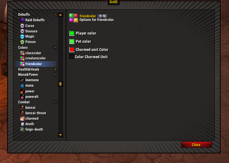
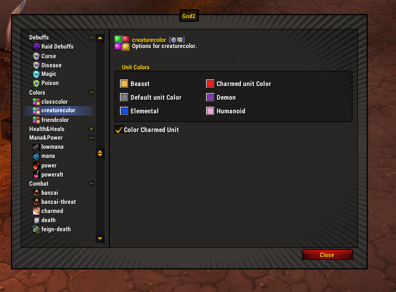
I haven’t really messed with the class colors, other than to change charmed unit from red to hot pink. Red was too close to death knight.
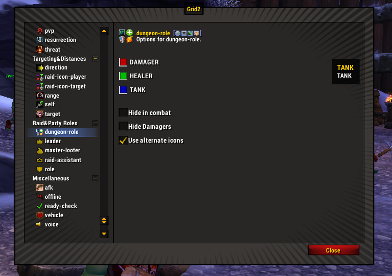
Dungeon role. Can be shown as a color or an icon (two sets available). You can also filter out DPS.
Power and mana. You will care about these if you want to make a mana bar for your frames.
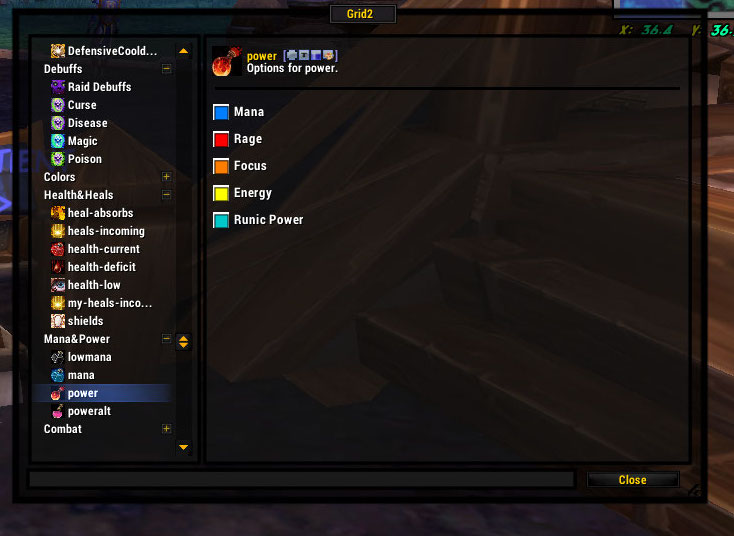
If you don’t give a crap about the energy levels of those crabby rogues (I don’t), then you can choose to just show mana.
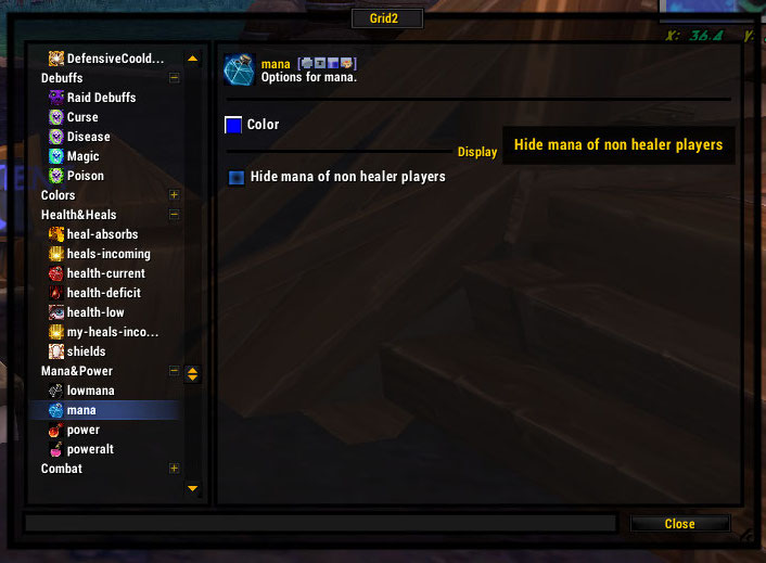
Notice there is an option to show only healer mana. This is what I use because I definitely need to know if other healers are having mana problems (and to hell with everyone else). You can combine this mana status with the low mana status so that the color shifts when the healer mana gets below a certain threshold.
Special Boss Statuses
There are a couple of statuses that will be super-important on some boss fights and other times you can basically ignore them.
Poweralt is the status that appears at the top of your screen (usually 1-100) when you engage a specific boss that puts a thing on you guys and you have to watch how much of it you have. On the Atramedes fight, back in the day, it was sound. If you got your sound up to 100, he’d chomp your face off. You can display this however you like. I usually use a text indicator.
Heal-absorbs is for the koragh fight (which I’ve never done but apparently this is a srs bzns stat to know). It’s basically an evil shield that eats your healing and you must heal it until it goes away so you can heal health bars again. It is tricky because heal-absorbs sounds good but is actually very bad. (In the multibar section, there are examples of how to display a heal-absorb.)
Buffs And Debuffs
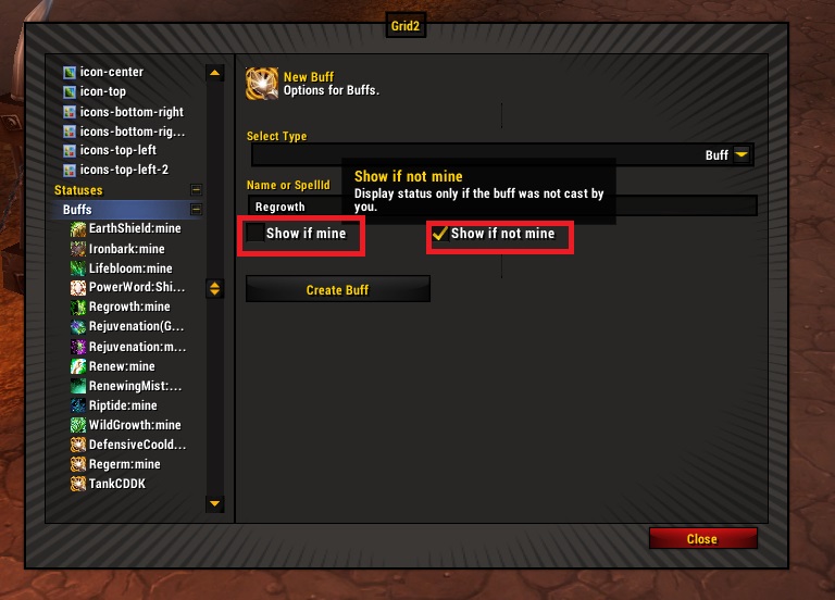
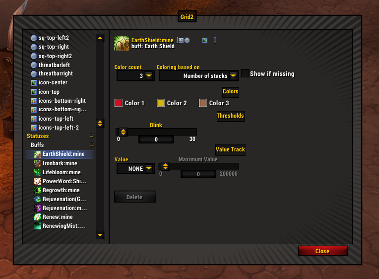
Let’s start with an easy hot or buff. Any will do. Most will be auto-available based on class (convenient), but a few will not. This is me on my priest. Renew, to the left, I did not create. It just was there! But Power Word Shield was not. So let’s make one.
Notice that you can track just your own. In most cases you won’t want to track other people’s stuff, so check mine only. If you want to track someone else’s, select show if not mine. If you want to show everyone’s check both.
The buff name will generally autofill with a drop down. Watch your spelling.
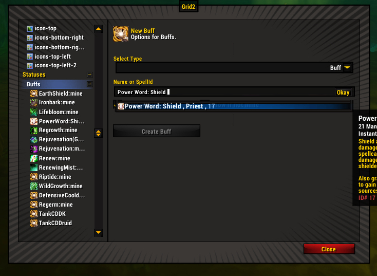
Accept the name, THEN create the status. The name won’t accept unless you press the button at the end of the name-input.
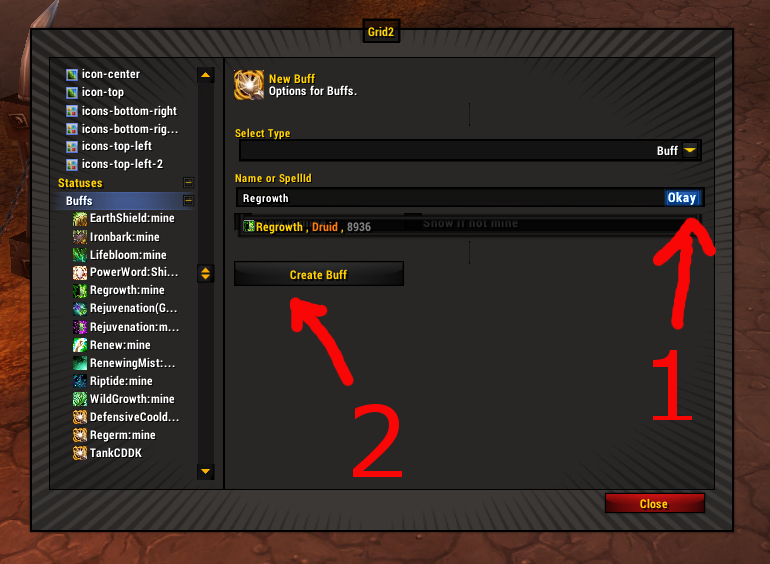
Congrats, you have a status. Go find your status on the list under buffs.
Now you can pick a color. Well, more than one. You can track stacks, time remaining, or value. When picking a color, pay attention to opacity (the plus/minus slider to the right of the color picker). Usually you just want it opaque, period, but sometimes you might want transparency.
Tracking stacks is self-explanatory, and something you want to do when stacks are important and time remaining is not (like earth shield – lasts for 10 minutes, will likely use up charges well before it expires). Set how many colors. It doesn’t have to be one color for each of the stacks. You probably do not care about charges 9 through 3, but once you get to the last charges you’d care. So you set 3 status colors – 1 charge left, 2 charges left, and 3 or more charges left.
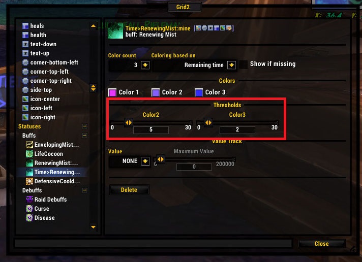
For tracking time remaining, I recommend 3 colors. You set your colors and then the threshold (time left) needed to trigger them.
- Color 3 is your standard color
- Color 2 shows you when it’s safe to reapply (the last 30%, usually 4 seconds, depends on hot duration, you have to do MATH).
- Color 1 I set at 2 seconds for “oh shit it’s going to expire, you moron.”
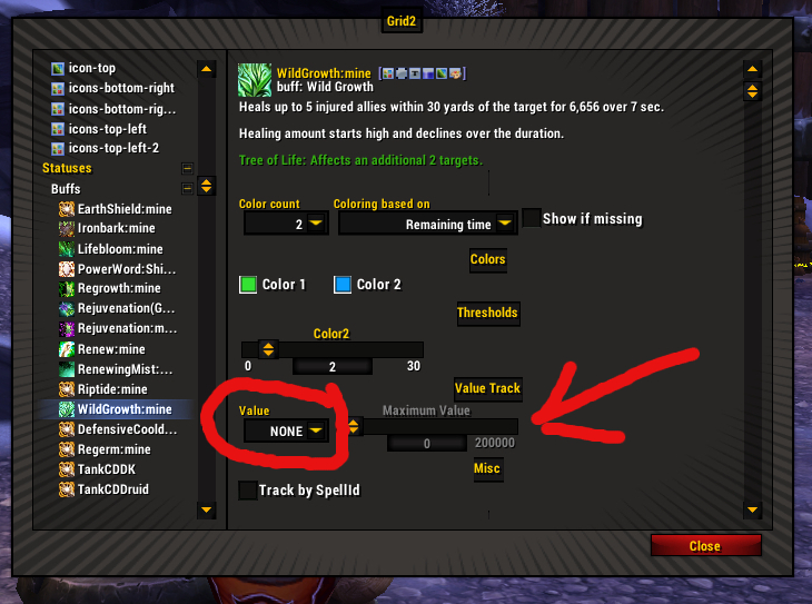
Value is a new thing that is probably intended to work with power word: shield and other statuses that have other stuff you might want to track. To be completely honest, I have yet to figure out how this one works, but will get back to you with that later.
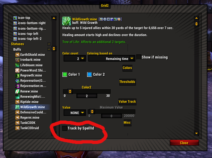
Using Spell ID instead of Spell Name – there’s a box for this in your status. Most times you won’t need to. However, it works out really well for those pesky statuses that are named the same (like the soothing mist from a statue versus soothing mist from your little monk hands).
Or you can blink your status if you’re not doing color shift.
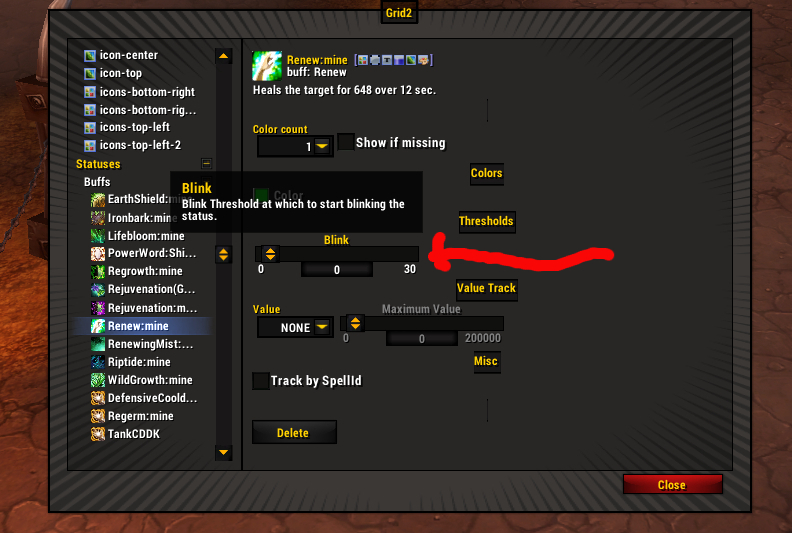
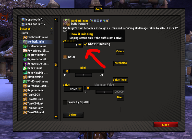
Or you can show if a buff is missing.
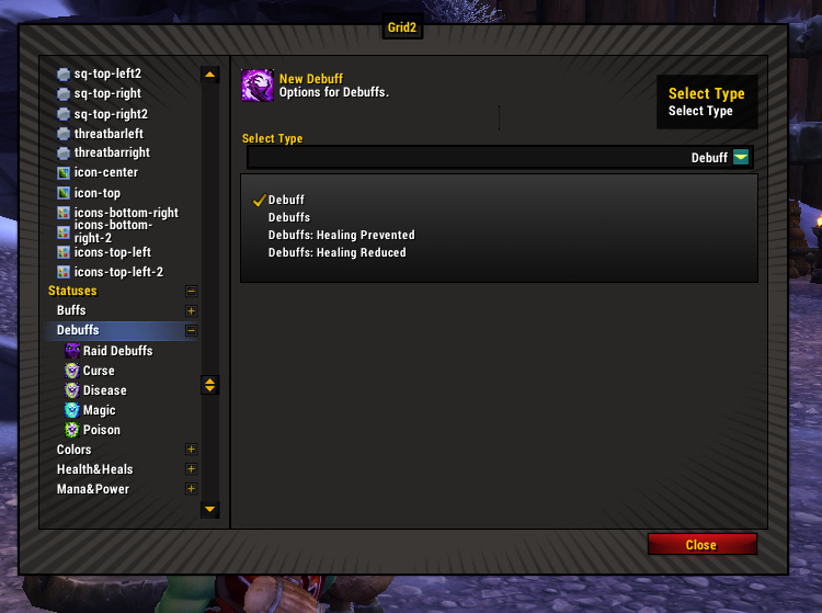
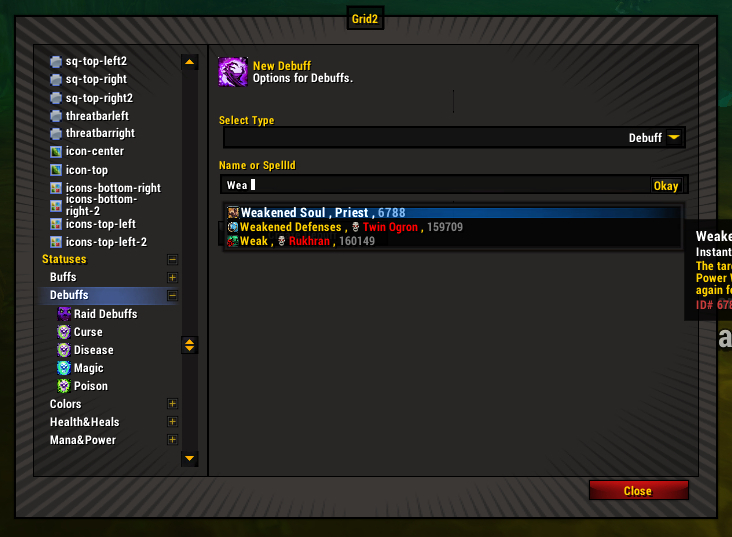
A debuff status is made in the same way as a buff. I would generally make one for Weakened Soul if I were priesting. Make sure you track WS from all sources, since it doesn’t matter who applied the debuff, it only matters that it is there and you cannot rebubble.
Prefixes
Or “creating two statuses for the same aura, because reasons that you will see in a minute.”
What if you want to track Soothing Mist (from you) and Soothing Mist (from your statue) separately. Both are called the same thing, but have different spell IDs. However, when you try to create another Soothing Mist Status, you can’t, because you already have one status for Soothing Mist. But you can’t name it something random and have it actually create the buff status.
The same situation occurs if you want to track any buff applied by someone else that you are in danger of overwriting while also tracking that buff applied by you. In that case you’d want two statuses: buff (mine) and buff (everyone else’s).
This is where you use prefixes. If you use a “>” or a “@” in the name, you can customize the name without throwing an error, and use the same buff that is already taken by another status. For my jade statue soothing mist, the statue mist is named Statue>Soothing Mist. Then, of course, for each of your soothing mist statuses, you’d track by spell ID.
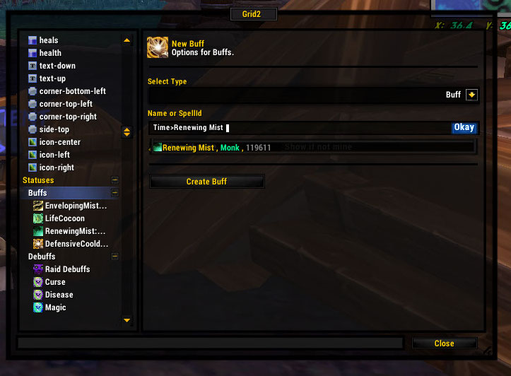
I’m setting a time-tracking status for renewing mist, so I can track it separately from stacks
I will actually delete and recreate statuses with prefixes (even if I don’t need to) because down the road it’s far easier to spot what you need if there’s a description.
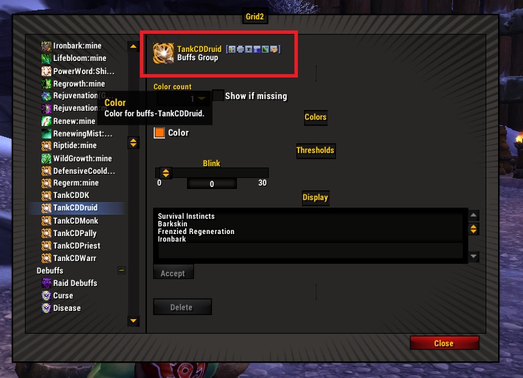
Buff And Debuff Groups
A group is just a bunch of statuses that you list together rather than separately. There is no reason that you can’t use a group to track a single buff – just put one buff in that group.
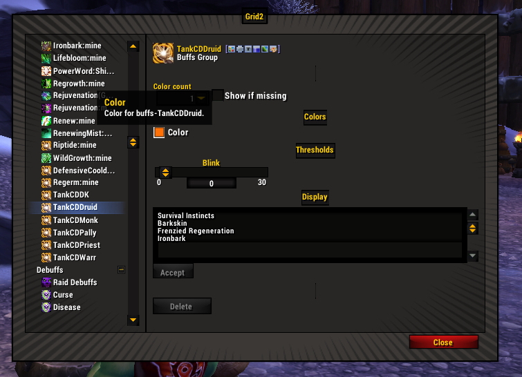
This is easy stuff because most of what you want auto-populates. Grid2 will make a list of tank cooldowns for you, and a list of raid debuffs already exists.
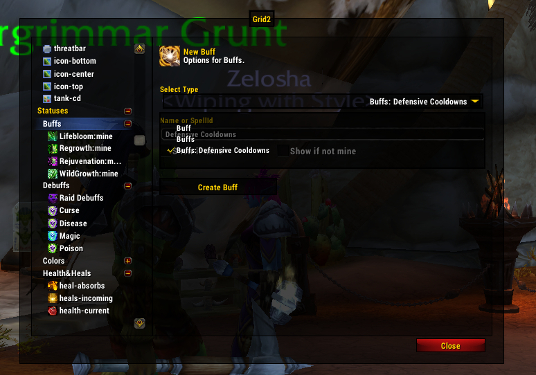
Buffs and debuffs on the lists are prioritized, the same way you would prioritize statuses on a given indicator. However, the groups are more manageable than adding 20+ different buffs separately and then adding them to an indicator.
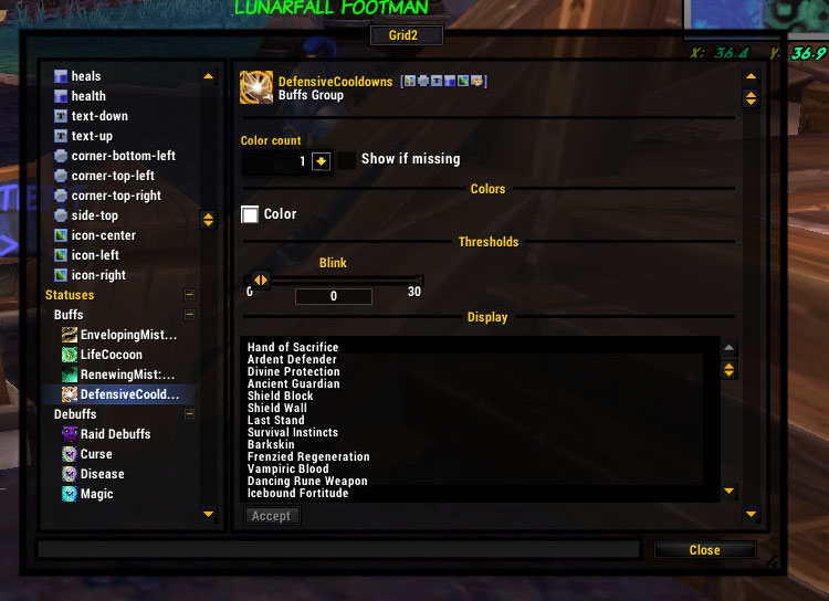
The color that you set for the group is the color for every buff in the group. If you want different statuses to be different colors, you can add them separately as individual buffs or make multiple groups (for example, make a group with only druid cooldowns and set the color to orange. Rinse repeat with other classes).
If you want to track stacks or time remaining by color, you should add buffs individually and not use a group.
- Status groups do not track stacks (even if you only have one status in the group). To track stacks you should add buffs individually.
- For color-by-time, status groups will color based on the priority of the spells on the list. For multiple spells at once, it can be unclear what is expiring and when.
The best way to track groups is to use the icon indicator (or icons indicator). More on these later!
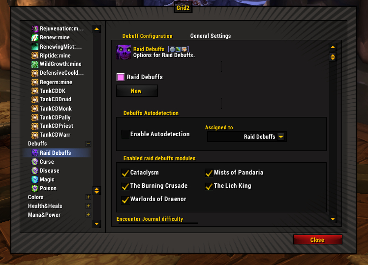
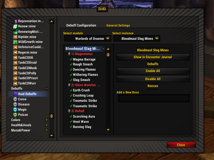
Raid Debuffs
This is a special preprogrammed group with fancy options. Much better than trying to list them all yourself.
Aoe Heals
…and Other Not-Hot Heals (Known in Grid-Prime as “Heal Trace”)
This indicator will briefly flash on when the heal hits the target. This can be useful for non-targeted heals to see where they splash. You can also monitor whether people are “standing in the good” or not. Then call them out for being lazy jerkwads.
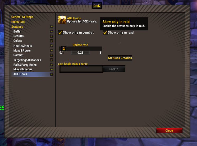
The aoe heal statuses work very similarly to the tank cooldowns buff/debuff group. The statuses will auto-populate based on class and generally have things that you want.
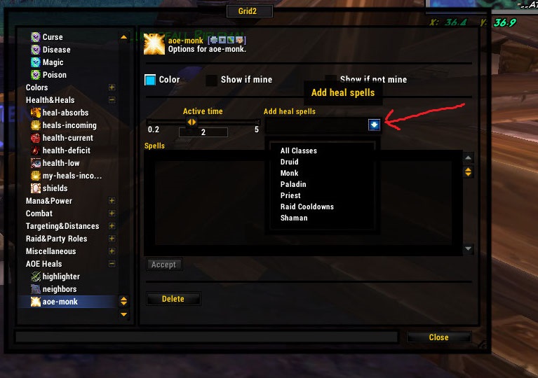
However, I might want to create more than one aoe-heals-group per class to separate certain heals from other heals. This is easily done by creating more than one group and adding only the statuses you want to each. You can create a group to track a single AOE heal.
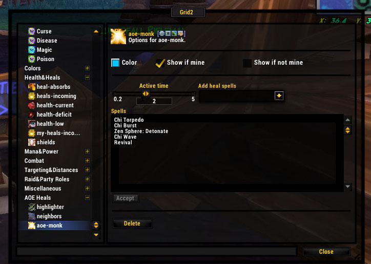
What happens when you select “monk” from the dropdown.
You can create an AOE Heals status to track just about any non-buff heal, even single-target. For example, I can flag the target of my penance or see where the pulses of my Healing Stream Totem are going.
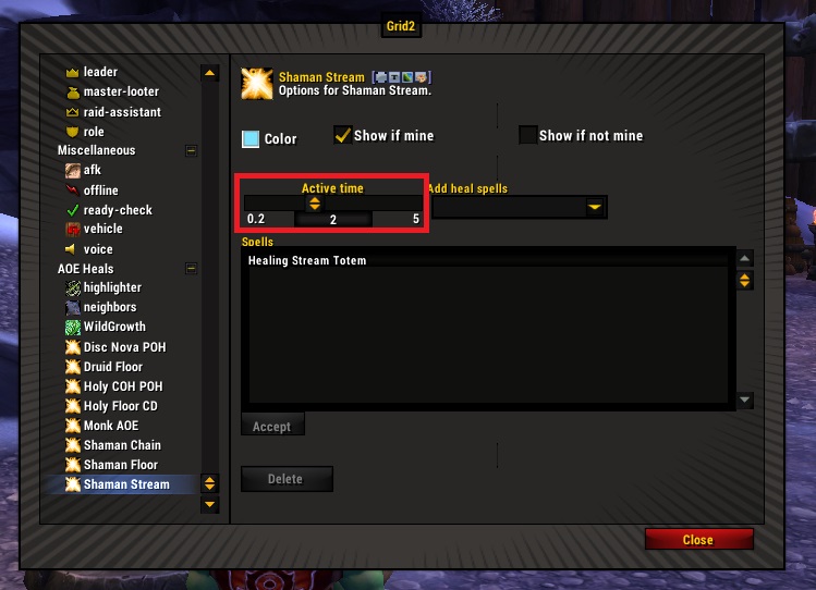
The active time is how long it blinks on before it decides that it has warned you enough and can shut off. I set this around 1 second for most things. For things that pulse, I set it to roughly the interval between pulses so, if it continues hitting the same target, it does not blink on and off. Since the pulse for my healing stream totem is something like 1.8 seconds, I have the active time set to 2.
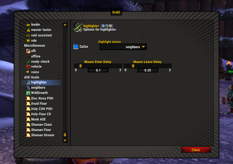
Range, Groups, and Highlighting
(These are located under AOE heals, before your custom statuses). Whereas the aoe-heals that I’ve programmed above are the result of where your aoe heals land, these statuses are predictive – where is the best place to launch my aoe heals.
There is a neighbors status. You can set it to whatever range you want.
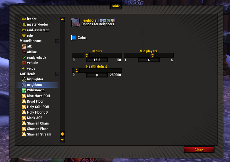
As you can see, you can set range between players, how many players, whether they are injured, etc. This neighbors status is set to 12.5m and would be ideal for chain heals. If your entire raid is stacked up, everyone will light up since everyone is in a cluster.
There are also preprogrammed aoe cluster trackers, such as Wild Growth on my druid toon. In this case, you can have the status only show up on cooldown and pick the one best person to cast the Wild Growth on (Max Solutions). I have my max solutions set to 2 now because I like options. Also, if you have the glyph, you may want to set min-targets to 6. The health-deficit is up to you. Right now my WG heals for 20k. I have my deficit set to 15k because I will likely want to start hotting before all the damage hits. There’s cast time to consider, plus how much health will be lost over the course of the ticking hot.
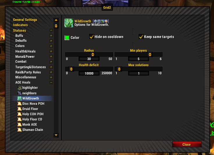
AOE status of wild growth (for the range/highlighter) not to be confused with the buff/hot tracker for wild growth.
Then comes the highlighter part, if you want to use it. Highlighter means that instead of showing up all the time, the neighbors (or wild growth) status will only light when you hover over a player, so you can see who is nearby that player.
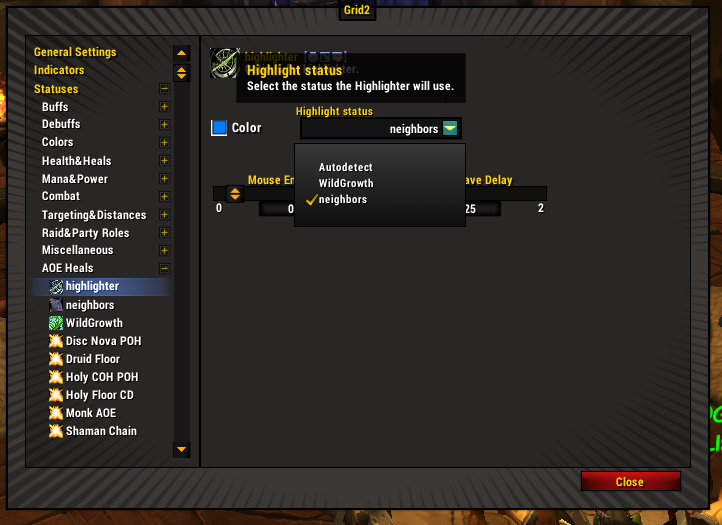
See the dropdown up there? I’ve set it to neighbors. So when I highlight, it uses the neighbor setting. I could also set the dropdown to wild growth, as you can see (status is on the left, right under neighbors). Because I limited my WG to 2 solutions in the whole raid group, I don’t think I need to limit it to highlighter as well.
You can also fiddle with the timing on the highlighter and delay it on mouseover.
Deleting Statuses
Once you’ve created a status, you cannot change the name of the status or, for a buff, whether it tracks only mine or others’. There is no harm in having unused statuses. But if you really want to nuke it from orbit for neatness, make sure it is not attached to any indicator. Otherwise the delete button is grayed out.
Indicators
Indicators are how you intend to show the thing you want to show.
Indicator Limitations
Your statuses may not necessarily be viewable on all indicators. How you tell is the little line of icons next to the status.
from left to right – this status can be shown on an icons group, box, text, bar, icon, or by color.
As you can see, buffs are pretty versatile and can be added to just about any indicator.
Box, icon, or color. That’s what you get.
Aggro is more limited.
Priorities
You can put many statuses on the same indicator, but only one will show at a time. Whatever is on the top will overwrite the others. You don’t want to have important statuses obscured, so watch it when sharing.
Multibar and the icons (plural) indicators will show multiple statuses at a time, but priorities still count. If you have an icons indicator that is limited to 2 icons and you have 5 statuses in the group, the indicator will only show the top 2, based on the priority of those statuses.
Default Indicators
Alpha is a default indicator set to fade when someone goes out of range. It is also set to fade them if dead or disconnected. If you set it to fade when dead, it is difficult to know if a corpse is in range for a res, so I do not recommend that.
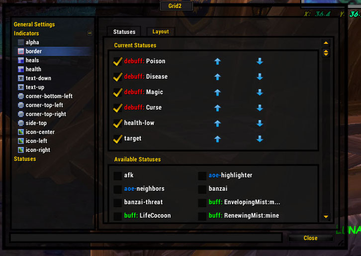
Border is something that is very visible so save it for things that are very important. The default grid2 setup has aggro and cleansable debuffs sharing an indicator which I do not recommend, because you need to see both at the same time. I recommend moving one of them to another indicator.
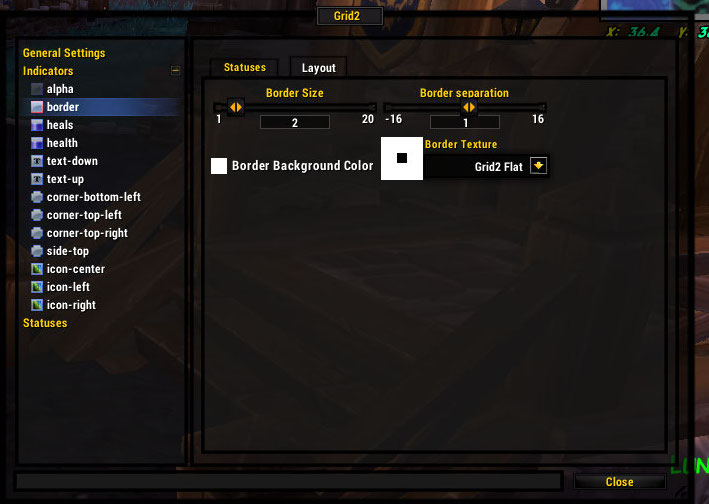
If your border isn’t showing up, try changing the texture. Grid2flat (above) works just fine and I believe it is the default. Some border textures are dark or too skinny and will be no help showing your statuses. The default width is 2, which seems perfect. A 1px border is hard to see.
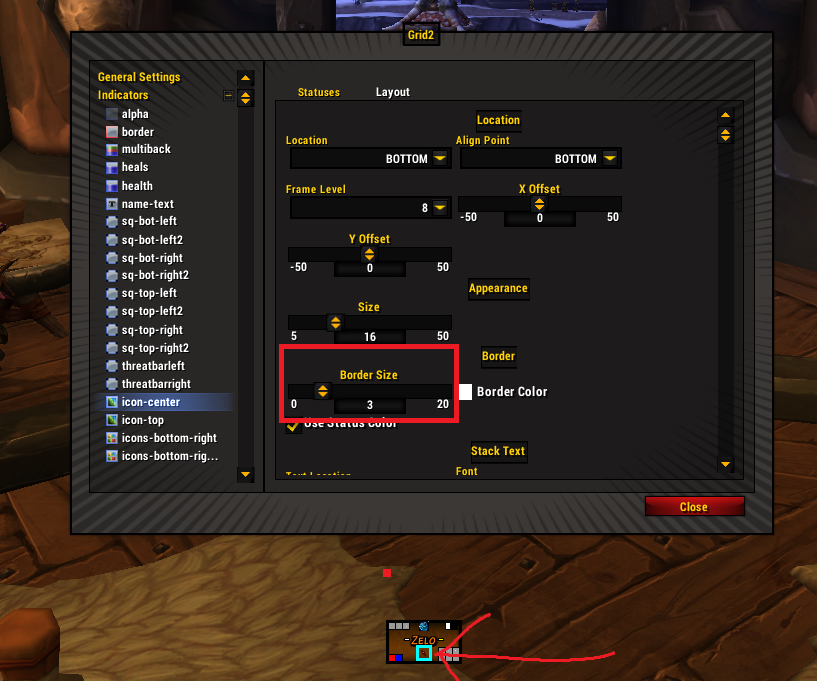
In all things, whether the border on a frame or the border on an icon or box, the border grows INTO the item, not out of it. If your icon is 16×16 and you put a 1px border on it, the overall size is still 16×16 and the icon itself is now 14×14.
Health Display: The health bar by default, takes up the whole box. It is very important that you only have ONE status on the health bar, and that is health-current. If you put anything else there (like, in a well-meaning manner, you check the status for low health warning), you get the fucked-up situation of the bar stopping at a value that is not the player’s health. The bar looks half full and the player is at a sliver of health.
If you want to customize your health bar based on low health, poison, disease, mind control, or aggro you handle that on the colors tab.
There is a heals bar attached to the main health bar for incoming heals. You can see your heals, everyone else’s heals, or all together. You can also customize the color of that one.
Color inversion of the main health bar is something you can do if you want dark frames with light/class color backgrounds.
Totally personal preference – with the following caveats.
- There is always a tint of the original color (pre-inversion). This might make you happy (I like it) or irate. If you want a totally uniform dark color for the bars, there are details below on how to make that happen (see “inverting colors without using the inverting colors option“.)
- Everything (text/boxes) looks awesome against a dark background. When the health goes down, the things that were previously easy to see are no longer easy to see against the lighter background of the missing health. Fixing this usually involves putting borders on the icons/boxes and more of a shadow/outline on text.
- Your frame background is now your foreground. You will have to adjust it in the General Settings for frames.
See, there’s a “tint”
Center Text (Name). If you use a status other than name you will have the actual text change to something like dead when the unit is dead. That is unhelpful as, in a big raid, if you have 3 people dead, you need to have the name there so you know which one to battle rez.
Now, you can change name color based on status. It can be used to show aggro, poison, disease, or what-have-you.
As with all text indicators, you have options for a shadow or outline on the text for readability. Fonts can be changed, also for readability, and resized. You can also shorten the names to save space. 4 seems to be the standard.
Optional second row of text. It’s built in but there’s no reason you have to use it or can’t delete it (I don’t use it) – or add a third row if you are so inclined. Here is where you can put things like the numerical value of health remaining, or percentage, value of a shield remaining, or statuses like dead. The color of the text can be adjusted separately as well.
Text Indicator
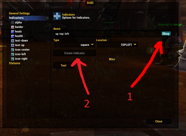
OK, let’s do a custom text indicator. First, we create the indicator. Name it something that makes sense based on its position on the frame like “text-top-right-corner.” This will help later when you’re shouting “where the fuck is that indicator?!”
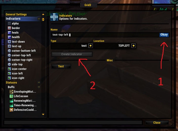
First hit Okay, then “create indicator”
As you see, you can adjust the font, size, and nudge the indicator over on the X and Y axis. You can also use a shadow or an outline on the text, which is highly recommended for readability. At this point, go ahead and turn on the test mode, located at the top of the indicator list, so you can get your indicator looking how you want it to. (Test mode is so SO useful, why don’t all mods have it?)

We are going to use the renewing mist: mine status. Use the check box to add it. Easy. The same on the color tab, if you want the color to change based on time/stacks. But it’s not necessary if you just want a plain white text.
Within the text indicator, you can decide what you want to track. You can track time or stacks, or both at the same time (they display with a colon between). I guess percentage is for health and stuff, I’ve never used it.
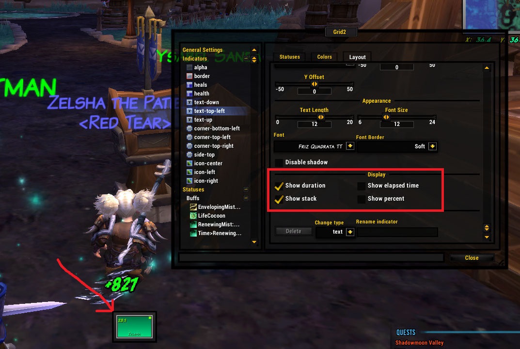
So now you’re probably wondering why we don’t use text for everything since it’s clearly very precise information. In short – too much information. For any given hot, for example, I do not need the specific number of seconds that are remaining. I only care when it’s in the last 30% and I can refresh it. Anything beyond that is excess noise.
Box Indicator
Why, you say, would you do a box when you have a lovely icon or a numerical countdown? In a word: space. Numbers need to be legible. Icons need to be big enough so you know what the eff it is. Boxes can be teeny and still show you the relevant color info.
Let’s create a box. Easy.
Boxes have border, sizing, and x-y axis positioning options. And you can make a rectangle. Options for rectangles are endless and can help you make the space work for you.
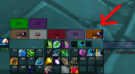
See, the tank has aggro (name underlined)
And another way to show aggro with rectangles (threat lines on either side of name)
Icon Indicator
First, we make the indicator. Choose a position, pick a not-stupid name.
For icons, it doesn’t matter what you set your status color shift on (stacks or time). The icon will display as the spell icon and track depending on the options you choose for that icon indicator (not the options in the status section).
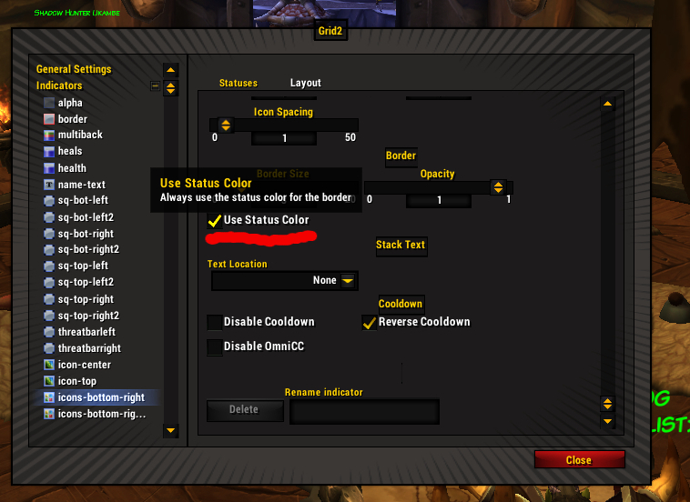
Most options are pretty self-explanatory. A lot of this is personal choice when you’re setting up an icon. How much space should the icon take up (you need to see what the icon is, but at the same time, that’s frame real estate)? Do you want a border? Remember, folks, borders go into the icon, not out, so the overall size stays the same while the inner image shrinks.
You can also set your border to use status color. That means if you have a poison, the border will be green. If you have a buff, the border will be whatever color shift you set for the buff.
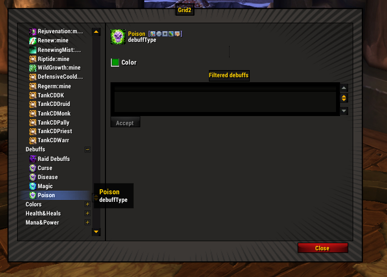
Because the poison has been set to green in the status settings, that’s why.
If you set your border to zero but are still seeing a border, make sure to uncheck use status color. If you use status color, there will always be a 1px border minimum.
Do you want the timer sweep around the icon? Do you want stack numbers? Keep in mind that the more information you add to the icon, the more clutter you have on your frame. A bunch of timer sweeps going in different areas of the frame can be distracting. Adding a stack count to a small icon leads to not being able to see what the icon is. Only add the stuff you need to make intelligent healing decisions.
Example: Adding Status Group To Icon Indicator
Let’s add raid debuffs (the group) to an icon indicator. It is pretty rare that you get 2 raid debuffs at a time that you have to deal with, so priorities are not usually an issue. Simply click on raid debuffs and you’re done.
By default, raid debuffs are set to the center icon. I can’t think of a better place.
Centered raid debuffs
Raid debuffs on the right.
Icons (Plural) Indicator
Time to make an icons indicator. This is a lot like making a single icon indicator, with a few bells and whistles. Changing icon size and border is exactly the same, as is positioning the initial icon.
The icons will be anchored to whatever the first icon is, wherever you place it (let’s say bottom right corner). The icons will then grow in the direction you tell them until you cap the number of icons. You can have them grow in a straight line, or by limiting icons-per-column, you can have a nice grid. You can adjust spacing between the icons. Again, you want to turn on test mode for this to make sure that you’re not clipping any of your other indicators – icons take up a lot of real estate.
Example: 3 icons in the top left corner, 6 in the bottom right (it is showing boxes instead of icons but trust me, they’re icons!)
And some with EPIC ART. The tank icons are purple.
This is the EPIC ART version of the above setup.
I use icons for tank cooldowns because often more than one is popped at a time and icons are easy to identify. I limited it to 4 icons, figuring that if we need more than 4 cooldowns, the shit has really hit the fan. Also, I ran out of space.
You can also add individual buffs to an icons (plural) indicator. I use this for rejuv and germination.
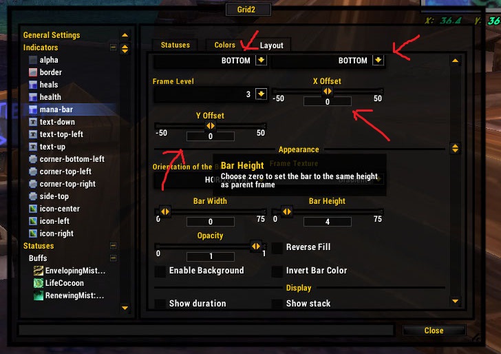
Bar Indicator
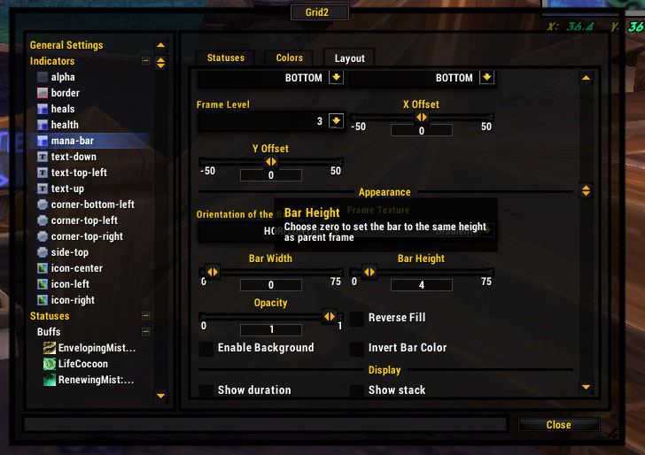
You can create a status bar for mana or a hot or… just about anything. A bar is just another indicator.
Bar Texture. Yes, you can set this to make your bars pretty or plain, depending on what you like. But bar texture is really for readability and ease of use.
Let’s say you’re making a very boring single bar for your health. You use class color for the color of remaining health, and you set your name text also to class color. However, they tend to blend together, even with a border on the names. I can’t just change the class colors in the class colors area because that will change the colors across the board and we’ll have the same problem. My solution is to use a “dark” texture to make the background a more muted version of the original color for better contrast with the name.
See, the first example is much darker while the second is pretty flat.
Yuck.
Another interesting way to use bar texture is to use a different bar texture on incoming heals.
The incoming heal is transparent but very shiny!
For example, I might make my incoming heals glossy so they’re easier to see, if messing with the color/opacity doesn’t quite do the trick.
Set a background. Let’s say you want the bars to be on a dark gray background instead of the default black for the entire frame structure. No problem. Easy. Or pick no background to just have it transparent all the way back, whatever.
In this example, the background is shiny so the missing health is easier to see.
For a normal (not-multi) bar, the background does not get its own texture. It inherits a texture from the entire frame texture that you set back in General Settings.
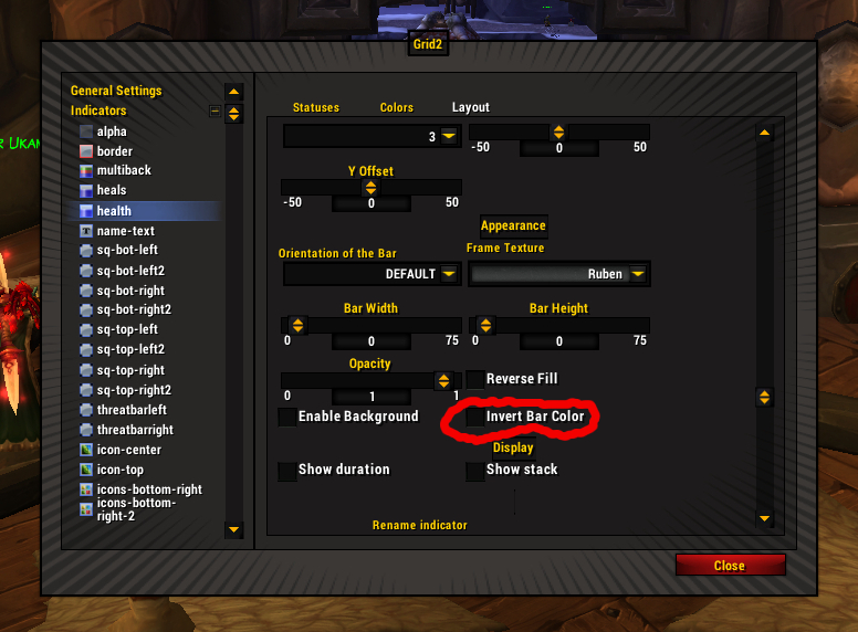
Invert Color. This can be done on any bar, not just the health bar. On the default health bar, this means that the health bar is now dark and the health missing will show up as the bright class color.
Remember, your health bar is now technically the background. If you want to change the texture, you have to change the frame texture in General Settings.
Usually the inverted frame will show a tint of the class color. If you hate this and want true-black as your bar color, see below for Inverting Colors Without Using Invert Colors Option.
If you invert your health bar color, you should invert your heals bar color too or it won’t show up. I won’t lie though, incoming heals are harder to see on inverted bars.
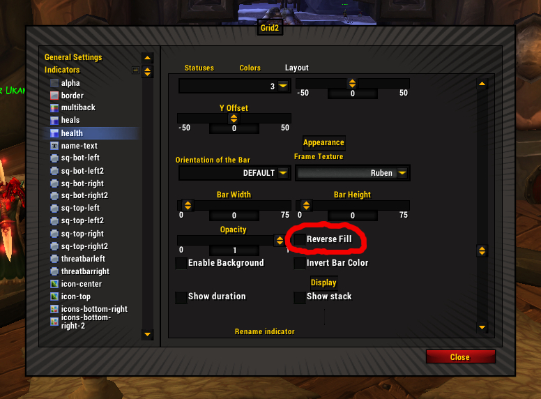
Reverse fill means that the bar depletes left to right rather than right to left. Or down/up if you are doing vertical bars.
Simple Bar
For some reason, I cannot live without a mana bar. I’m guessing a lot of you can’t either.
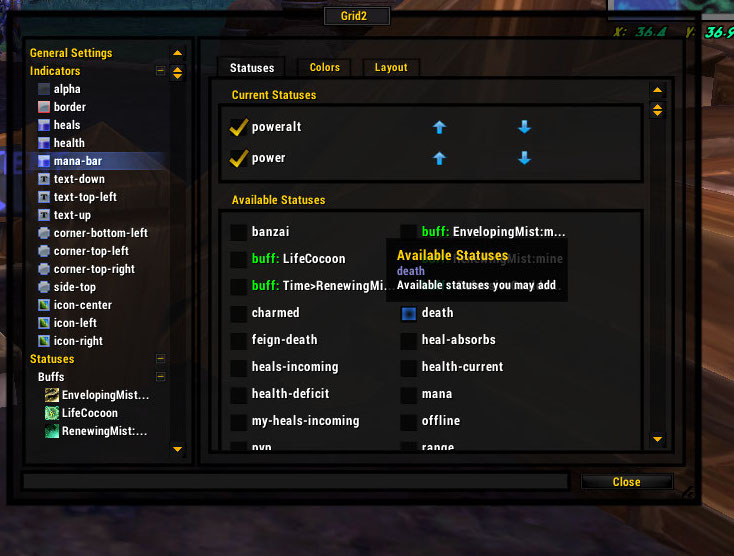
Fortunately, there is no need to create a status. Power is there and color-coded for mana, energy, rage, and whatever the fuck hunters and death knights use.
You can also pick mana and ignore the not-mana classes.
Create the bar like you’d create any other indicator. As with all other indicators, you can control the positioning and size. If you set the width to zero, it will automatically stretch the width of the frame. Choose whether the bar is vertical or horizontal. You can also pick a background color and bar texture.
Add the power/mana status to both the indicator and the color. Done.
Voila!
If you add another status at higher priority than mana, it will overwrite the mana bar when that status is present. I do this for poweralt because in the rare circumstance that I actually need to know the poweralt levels, I can live without seeing mana bars.
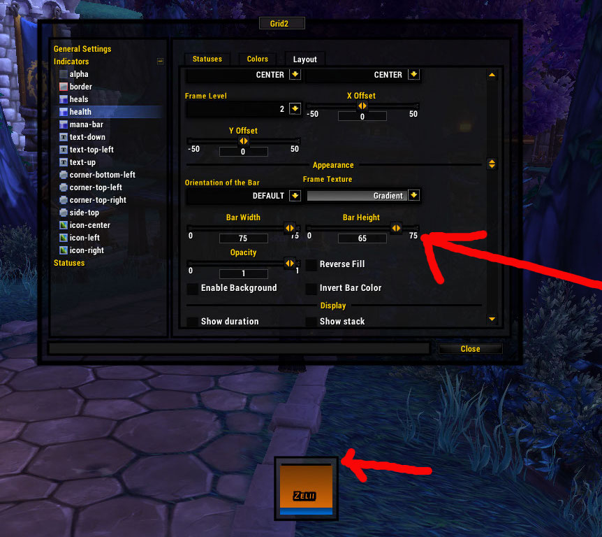
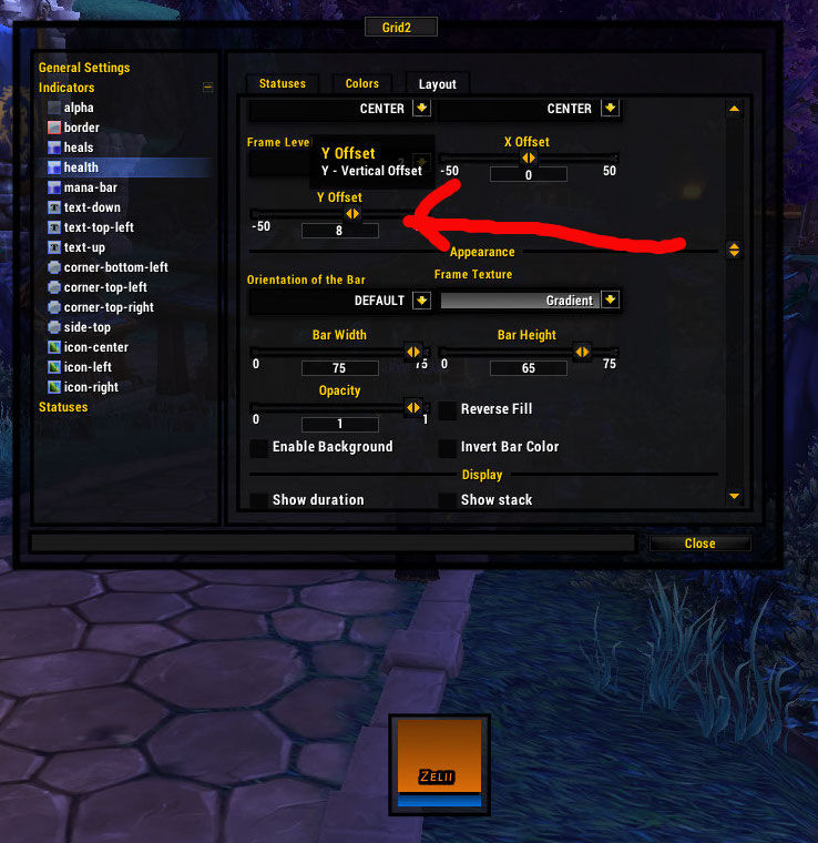
How to deal with vertical frames and horizontal mana bars. In this situation, you get the unfortunate consequence of the mana bar obscuring the last little sliver of health, which is kind of important to see. In that case, you want to slightly reduce the vertical size of your health bar – which is attached to the center of your frame, so you nudge it upwards so the mana bar does not overlap in any way. You may have to use math.
Example: My frame is 40×40 and my mana bar is now 4 px high. But wait, your mana bar is not 40px wide and your box is not 40px high. You have a 1px border on each side (between health and the border indicator) and THEN a 2px border indicator. Take away 3 on each side and we’re at 34×34.
You reduce the height of your health bar to 30 px (30+4=34), but it still looks not right because the reduced health bar is anchored to the middle of the frame. You still have a gap at the top and a small overlap over the mana bar. You adjust 2 px up on the Y axis and now everything fits!
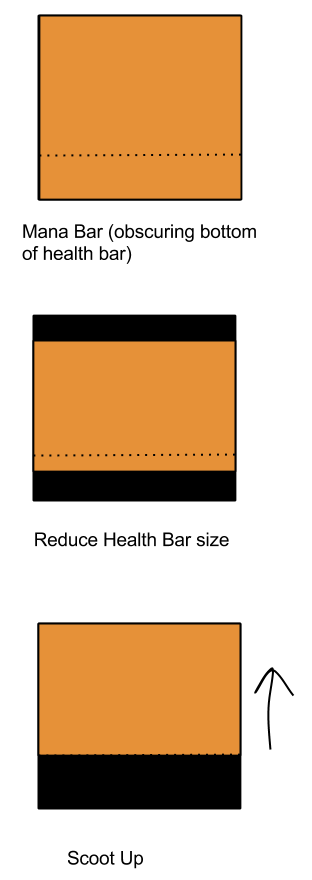
Reduce the size of your bar. Mind the gap.
Adjust upward to fill the gap.
If everything doesn’t fit and you’re tearing your hair out, you might want to adjust the overall size of the frame to make everything work out. Math is all well and good but moving sliders until things look right works just fine too (and what I usually do).
Multibar
A multibar does NOT mean multiple bars. It means two or more statuses showing at the same time on the same bar, stacked end to end or overlapping each other. This is different than the priority system where a single normal-bar will show only one value at a time. As far as I know, Grid-Prime and Vuhdo don’t have anything like this, and now I cannot live without it.
In terms of creation and size, it functions exactly the same as a normal bar.
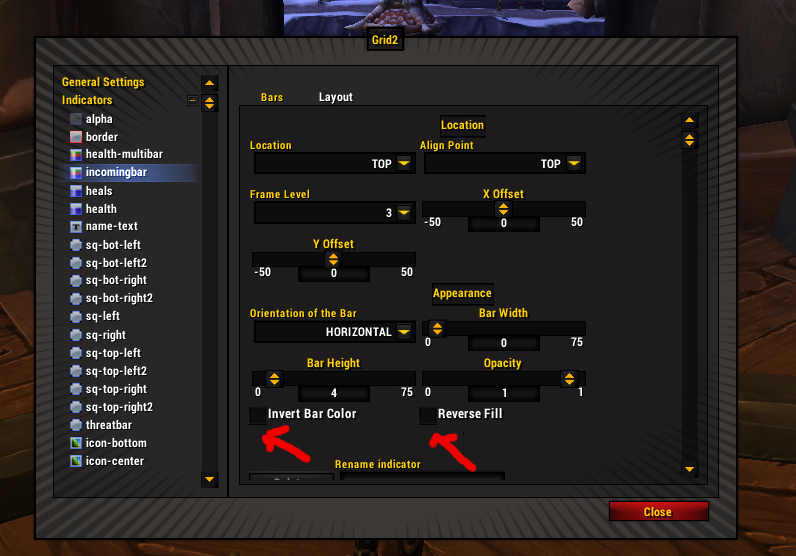
Here you can invert bar color or reverse fill the bar – and set width and height.
Only the initial bar can be a status color (like class color, or shifting based on time left). [Note: Dynamic Color is the terminology for status color from a previous version, I will be updating screenies when I have time.]
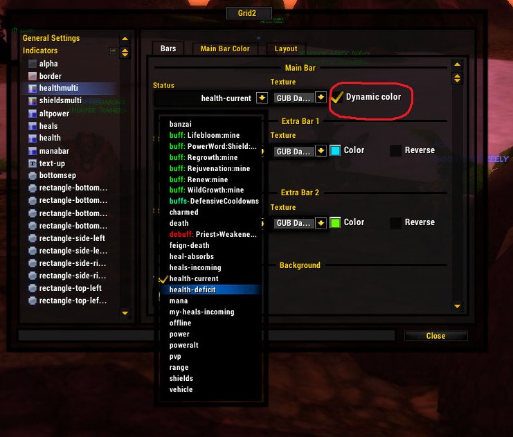
Multibar, status color on main bar
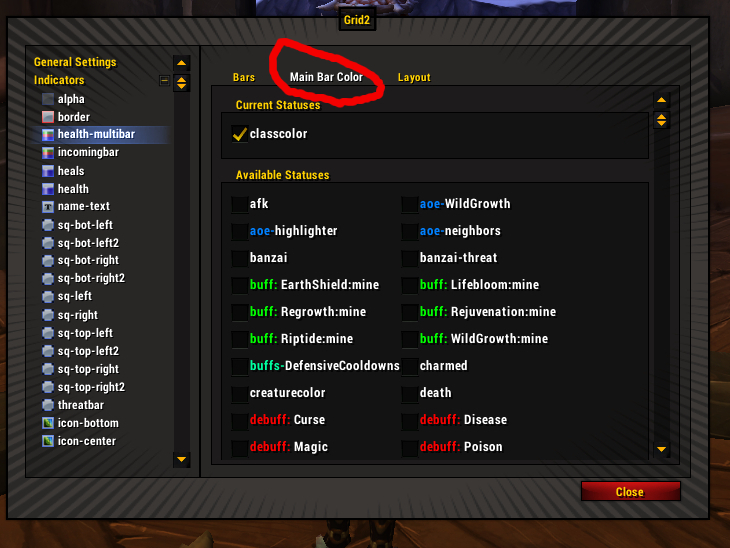
The colors for the secondary bars are set within the multibar indicator options.
Basic Example
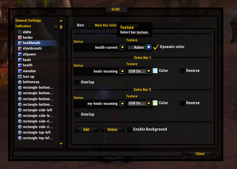
Let’s say you want a health bar and then at the end of it, instead of a single status for all incoming heals, you want TWO incoming heals: one for heals-from-you and other from heals-from-everyone else.
So you pick health-current for the main status (status color optional) and then configure the secondary bars for heals-incoming and my-heals-incoming. (Don’t reverse or overlap – that is for later).
What you end up with is something like this:
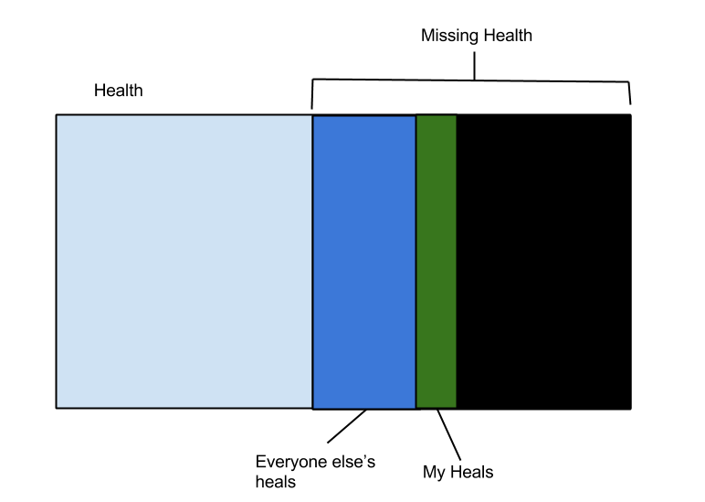
EPIC ART of above setup
Fill, Reverse Fill, and Overlap – A lesson from the Addon Author
I was really getting it wrong. I love the multibar but I’m apparently incompetent at using much more than the simplest config. So here’s michaelspain explaining how to do very cool things with a multibar.
Example 1: Basic Heals and Shields
Reverse bar option in multibars does not force the bar to start at the right of the frame. As you pointed out multibars are really stacked bars, that is the “default” behavior.
So lets see a usual non reverse bar case:
|====health===> |===heals====> |====shields====>In this example, the bars are not reversed and the overlap option does not matter: you can enable/disable overlap, and the behaviour is exactly the same. Overlap has no effect if all bars are flowing in the same direction, because the bars are always stacked by default.
You can ignore overlap and reverse options, but now we have a problem with some bosses mechanics: for example koragh heal-absorb-shield.
Example 2: Heal-absorb Display
When a player has a heal-absorbs shield, the above bar configuration will show a incorrect picture of the player health/heals state, we need one more bar:
|===health==>|==heal-absorbs==>|===heals==>|==shields==>
Reversing the heal-absorb bar
But this configuration is not very useful, so lets “reverse” the heal-absorb bar: Enabling “reverse“, the bar will flow in the oposite direction (hiding and overlapping the previous bars), but does not change his start point.
|=======health===========>
       <===heals-absorb==|
                         |===heals===>|====shields====>
But this configuration has a big problem: the heals bar is stacked, because the default behaviour is to avoid overlapping bars. And this does not represent the real state of the player, because the heals-absorb shield negates some or all incoming-heals.
Enabling Overlap
So the obvious fix is to enable “overlap” for the heals bar, in this way the multibar will display this (assuming the incoming heals are not enough to fully destroy the heals-absorb shield)
|=======health===========>
       <===heals-absorb==|
       |===heals===>     |====shields====>
And if the incoming heals amount is bigger than the heals-absorb shield , the multibar will display this:
|=======health===========>
       <===heals-absorb==|
       |===heals================>|====shields====>
As you can see, the overlap option forces the heals bar to start at the end of the previous bar, and not at the topmost bar.
Example 3: Really Complex
In a more complex example (adding heals and my-heals bar), we have:
|=======health===========>
       <===heals-absorb==|
       |==my-heals==>|==others-heals==>|====shields====>
In this example we have to enable overlap for my-heals and other-heals bars.
So the final bars configuration is:
health : nonreverse
heals-absorb: reverse
my-incoming-heals : nonreverse / overlap
other-incoming-heals: nonreverse / overlap
shields: nonreverse / nonoverlap
Dark Bars Without Invert Colors
Suppose you want a dark bar, plain black (no tint, as with inverting colors), and then want missing health to show up in class colors – kind of like invert colors but with a true solid black for the main bar.
Instead of tracking health-current on the health bar (or multibar), track health-deficit. Then go to the color tab and choose a color for the health-deficit part of your bar – in this example it would be class color. If you are using the multibar, check the status color box and then select a color on the “main bar color” tab. [Note: Dynamic Color is the terminology for status color from a previous version, I will be updating screenies when I have time.]
Then you use reverse fill and your missing health fills from the right side, which is basically the functional equivalent of tracking current health filling from the left side.
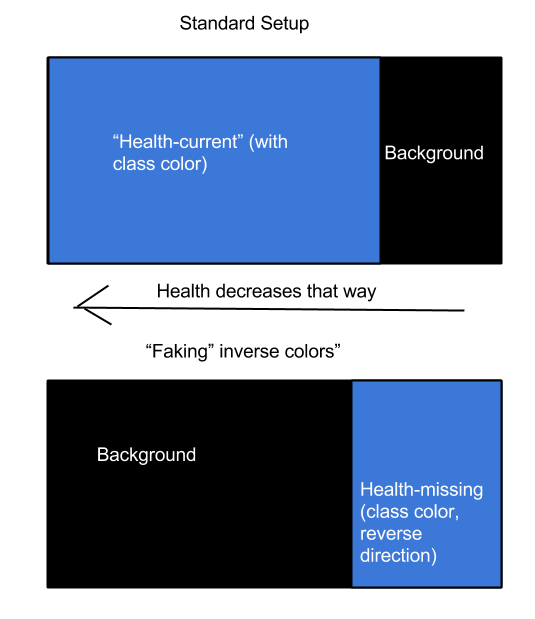
Me faking inverted colors. Fancy.
Removing An Indicator
So let’s say you’ve made a few indicators, as above, and then realized that you don’t want to use one. You’ve taken all the statuses off it, so that it doesn’t actually show a status and is effectively dormant. If you’re happy with that, you can just stop there. A dormant indicator has no effect on your display or gameplay.
However, in test mode, a dormant indicator will show up and if you have a bunch of them, they make a horrible mess and prevent you from effectively seeing how it all works in test mode. This may annoy you and you want to delete them.
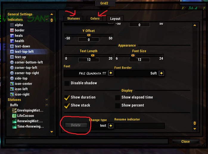
Before you delete anything, you must uncheck ALL the statuses and ALL the colors on the color tab (if applicable). Otherwise the delete box is grayed out. This leads to swearing. Once you uncheck all the things, you can delete the thing.
Changing An Indicator
If you want to change an indicator, you can change position, name, and even type of indicator, without having to delete the indicator and start over. If you create a box for a status and then would prefer it to be a text display, you can change from box to text (and probably will want to change the name too, for consistency).
Changing the position (where it’s anchored, and then scooting on the XY axis)
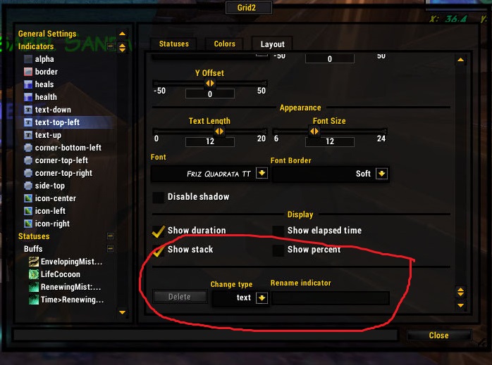
Change the type and name
Levels (or Layers)
The layer/level dropdown is there to determine what goes on top of what else if two indicators overlap. Imagine a sandwich, and the background is the bottom bread (Level 1). Goes all the way up to level 9 (the bacon).
In general, the defaults work fine and you’ll get something like this:
Level 9: raid debuffs
Level 8: name
Level 6: indicators
Level 3: mana bars
Level 2: Health/heals bars
Level 1: background
Note that there are gaps in the numbering for a reason. You get to fiddle around and put things in front of or behind each other if you want to get fancy.
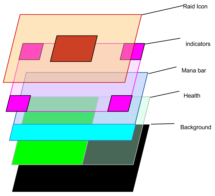
Epic Art of Layers/Levels
Creative Layouts
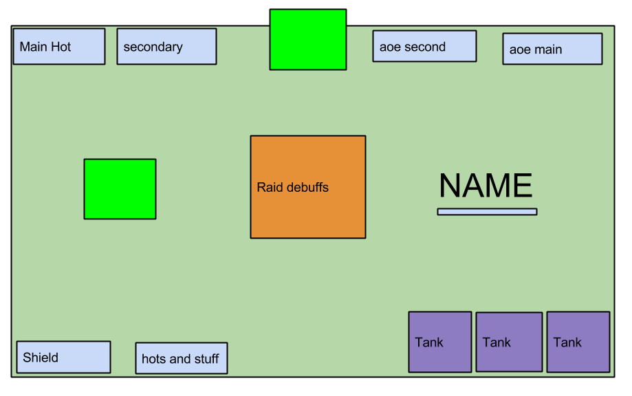
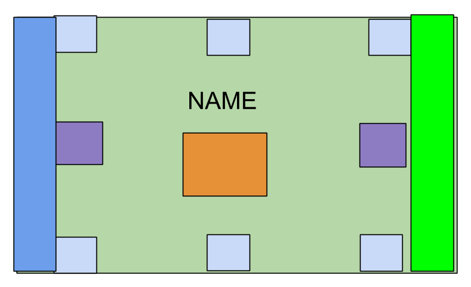
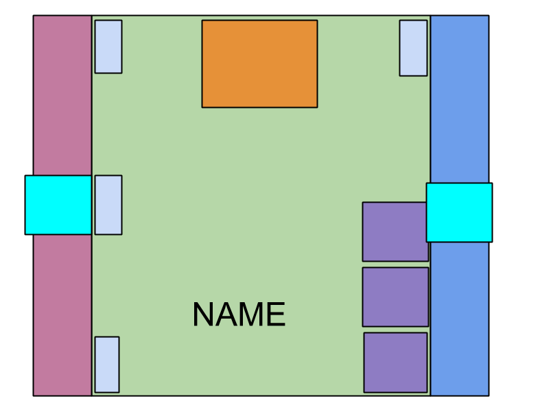
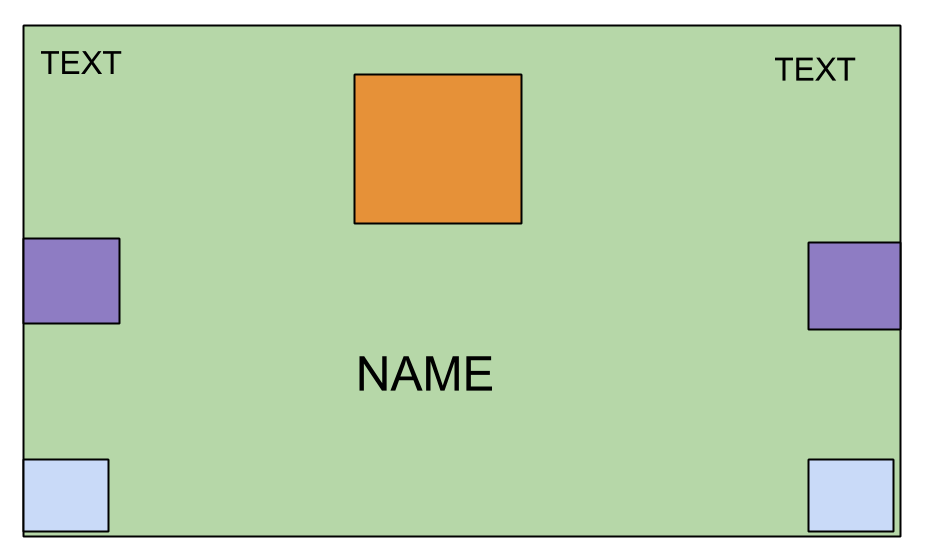
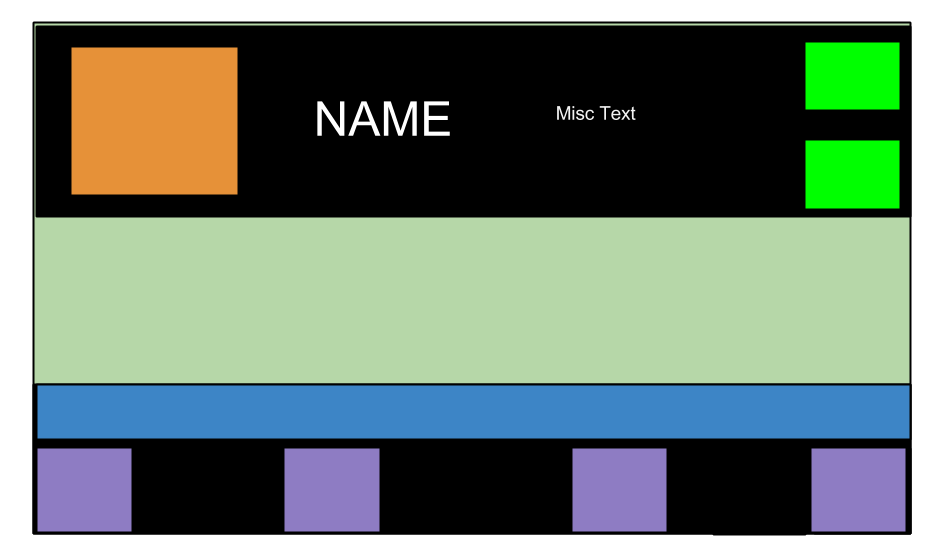
Generally people think they are limited to the edges and corners of the frame with the name and icon in the middle. But there’s no law that says you have to do this.
Here are some layouts that may give you ideas. I don’t recommend downloading anything that is too old, or it likely will not work.
And I used my EPIC ART skillz to make a few sample setups.
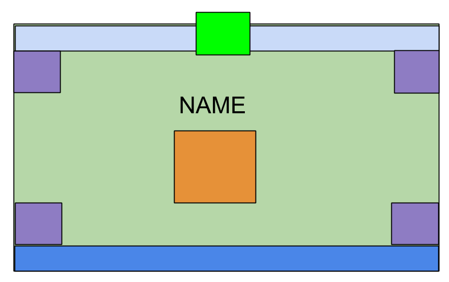
![]()
If you see a grid or vuhdo layout that you like, you can probably approximate it with Grid2.
FAQ
1. Can I rename a buff/status?
Nope. You can delete and remake it with a new name.
2. Can I rename an indicator
Yep.
3. Can I change an indicator
Yep. From a text to a bar to anything else. Also you can move it to a different corner and change alignment.
4. My incoming heals are not showing even though I have the incoming heals status added to the heals bar.
By default, incoming heals do not show YOUR heals (there’s a separate status for just your heals). If you want to show them all together, find the check box and use it.
5. I just loaded up a profile, and there’s all this shit from the profile I was previously using. How do I make it go away?
/reloadui is your friend.
6. If I use a multibar for heals, should I delete the default health/heals indicators?
If you do, I’d suggest backing up your settings first using a profile. However, you can make any indicator or bar “go away” just by unchecking all statuses so deleting is unnecessary. Any blank indicator that you have dormant will still show up in test mode, though, and may clutter the field.
7. I’m trying to drag my frames around but I’m failing!
Try using the test mode for group layout (not test mode for indicators). Then drag your group around to wherever you want it, and then exit test mode.
8. How do I test things like incoming heals outside a group setting? Should I jump off the roof to get damaged?
You can do that, or you can whack the tanking dummy in your garrison once or twice and run away.
9. I’m trying to use the multibar for a health bar but cannot show incoming heals in class color?
You’ll have to use the default heals bar setup if you want incoming heals in class color. For multibar, the secondary bars do not use status colors.
Changelog
Yeah I know I haven’t been tracking changes the whole way. Sue me.
7/1/2015: updated range/neighbors/predictive healing section with better explanation of Wild Growth settings.